BASECREATIVE

Refreshing a world-renowned British loudspeaker brand
In order to meet the challenge posed by newer competitors in the market, KEF sought Base Creative's help in refreshing the brand and repositioning it for the future.
The client
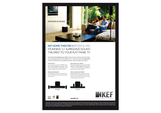
KEF, originally founded in Britain in 1961, has long been one of the world’s most respected brands of high-end audiophile hi-fi speakers. KEF speakers combine the latest in acoustic science with artistic flair in their design to give faithful sound reproduction while complementing the environment in which they are placed.
The challenge
Like many older brands, KEF had lost some of its lustre with the passing years. Though still respected, it was becoming seen as rather old-fashioned and conservative. Following its acquisition of KEF, Gold Peak Group sought assistance in reinvigorating the brand to meet the challenge posed by newer competitors in the market. The key task for Base Creative was to give the brand a fresher, younger image without endangering its well-established reputation for excellence.
The creative solution
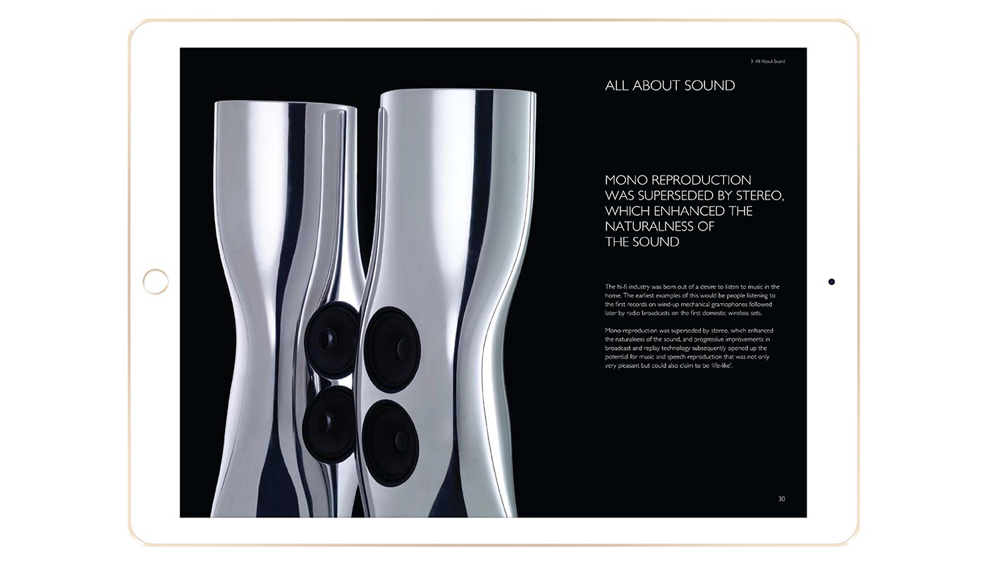
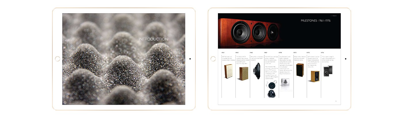
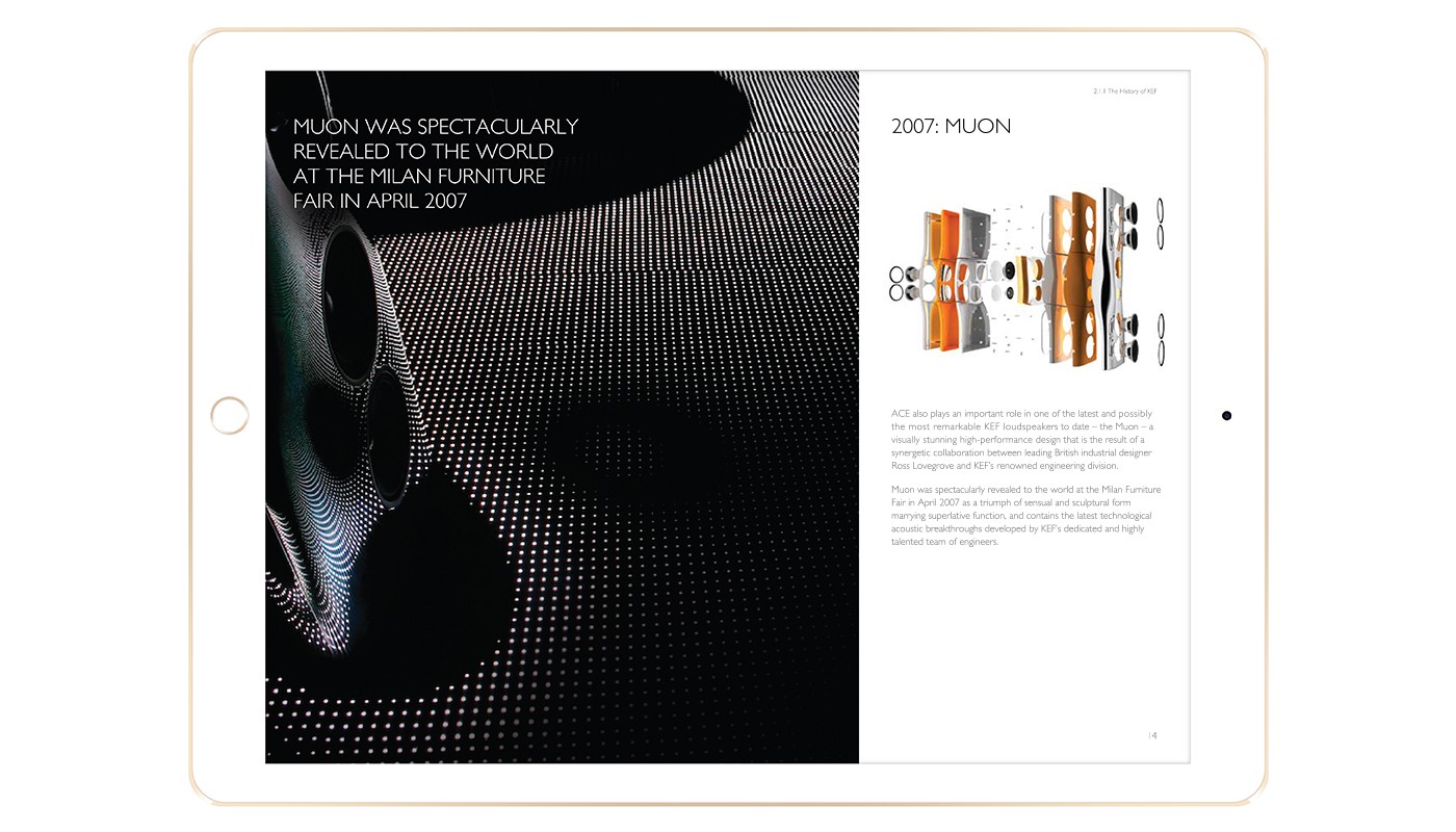
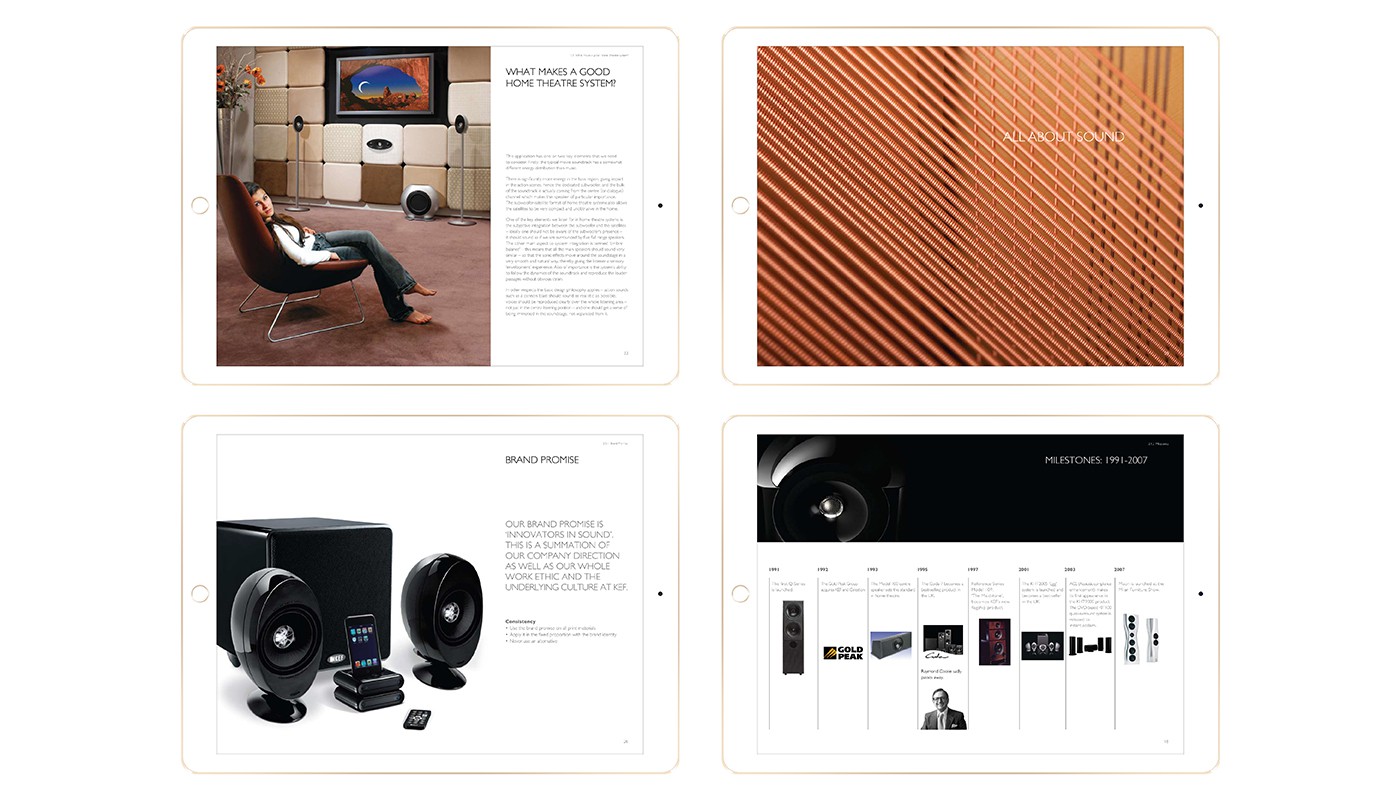
Base Creative identified the key characteristics of the target customer segment, and designed a brand grid which would appeal to this group. The essential characteristics of the brand and how it should be presented were gathered into a comprehensive brand book. In presenting the history of the brand, its continual development of new technological breakthroughs was emphasised, positioning it as a leader and trendsetter in the field. Care was taken in developing the brand writing and imagery to maintain the ideal balance between the brand’s long tradition, its position at the forefront of speaker technology, and the completely modern aesthetic appeal of its latest designs.
Brand positioning
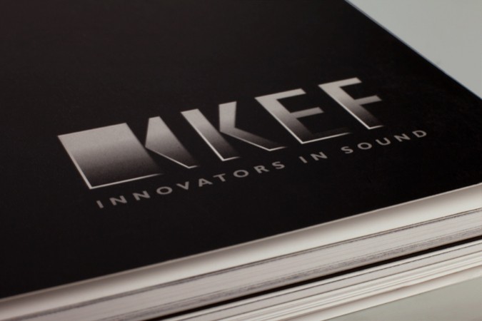
Innovation is what sets KEF apart. It's why we crafted the unique positioning: “Innovators of Sound”, describing some of the world's most gifted acoustic engineers and most innovative products at KFF. It also aptly sums up the company’s direction as well as its whole work ethic and underlying culture.
Brand identity
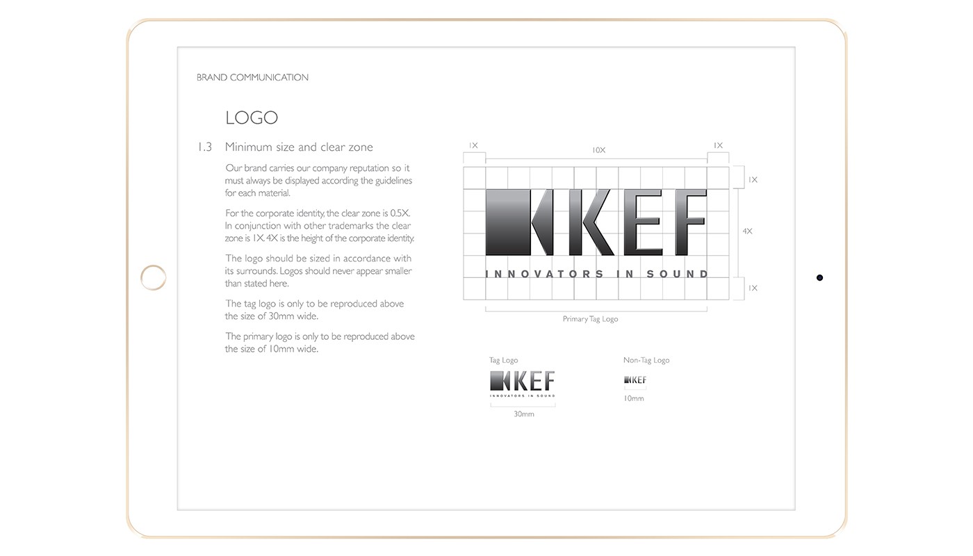
We refreshed the logo based on the positioning of “Innovators of Sound”. The outlines and sharp turns of the speaker graphic share the same contours with that of the letter K. The cone shape of the speaker graphic is also subtly mirrored in the negative space between the letter K and E, creating a harmony in linear progression when viewed from left to right. The alphabets presented in the logotype are also in perfect ratio to the graphic, symbolizing the brand’s enduring efforts and unchanging attitudes towards innovation.

Love this project? We'd love to help with yours
Related projects

© 2021 Base Creative Consultants Co. Ltd